What Your Niche Website Should Look Like
TL;DR Summary: Niche websites need more than just words – design and layout are vital for ranking and retaining visitors. Learn key features like wide niche coverage, clean design, tasteful ads, fast loading times, engaging formats, and clear calls to action. Discover how one site excels in these areas, setting an example of successful niche site execution. Read on for insights on optimizing your niche website for credibility, traffic, and conversions.
Let’s face it—most niche websites look like they were slapped together in a weekend. Cluttered sidebars, too many ads, and navigation that feels like you need a treasure map to find anything. The truth is, if you want your site to rank, attract links, and actually convert visitors, design and content layout matter as much as the words on the page.
The Anatomy of a Solid Niche Website
Here are some of the features every niche website should aim for if you want to look professional and keep readers around:
- Wide coverage within your niche: Don’t just write three posts and call it a day. Cover different angles, questions, and subtopics so your site feels like a complete resource.
- A trustworthy layout: A clean design that feels like a news site or magazine instantly builds credibility.
- Ads that don’t overwhelm: You want to monetize, but if your readers feel like they’re being assaulted with popups and banners, they won’t come back. Tasteful placement is key.
- Fast loading times: Nobody sticks around for a slow site. If it takes more than a few seconds to load, you’re bleeding traffic.
- Engaging format: Bold text, lists, subheadings, images—these break up content and keep readers scanning. A wall of text is a fast way to lose attention.
- Clear calls to action: CTAs at the end of posts guide readers to the next step, whether that’s subscribing, reading another article, or checking out a product.
A Real-World Example: Alpha-Multimedia.com
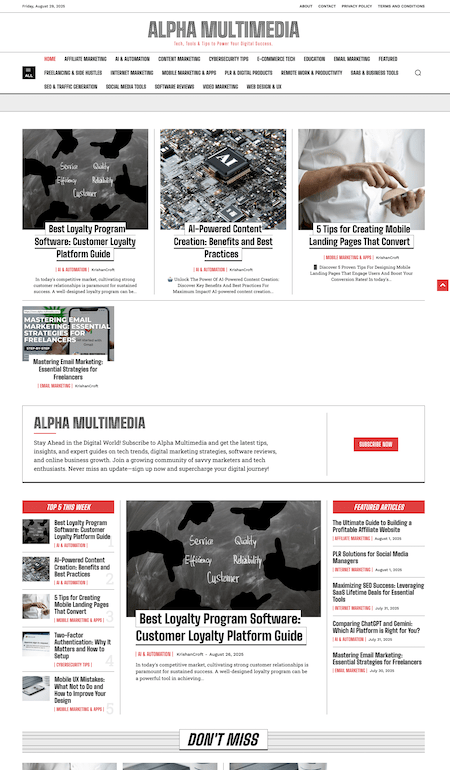
One site that does this well is Alpha Multimedia. It’s a niche site focused on affiliate marketing but covers a wide range of related topics. A few things worth noting:
- The layout feels like a news site, which instantly adds trust.
- Ads are there, but they don’t smack you in the face—they’re integrated tastefully.
- The site loads quickly, which is huge for SEO and user experience.
- Articles use strong headers, images, and lists so nothing feels boring.
- Related posts and CTAs at the end help keep visitors moving deeper into the site.
I’m not personally a fan of the sticky header overloaded with links, but the upside is nothing is buried in dropdowns—you can find what you need fast. That’s a fair trade-off, and it works in this case.
Ranking Potential
From what I’ve seen, this site is picking up rankings for keywords like:

- creative design layout
- SEO traffic generation
- what is open educational resource
That’s exactly what you want a niche site to do—hit a range of mid-tail terms that bring in targeted traffic.
The Bottom Line About What a Niche Website Should Be
If you want your niche website to perform, study examples that get it right. A clean layout, solid headers, related content, and smart monetization go a long way. Alpha Multimedia shows what’s possible when you treat your niche site like a real publication instead of a quick cash grab.
📄 Download a PDF of This Article