Do Centered Paragraphs Kill Your Website?

TL;DR Summary: Centered paragraphs make people work harder to read your website because every line begins in a different place. Keep body copy left-aligned and reserve centered text for short headlines, labels, and brief calls to action.
Centered Text Looks Nice… Until You Try to Read It
Centered text can make a website look balanced, polished, and even a little dramatic. That is probably why it appears so often in hero sections, service descriptions, and calls to action.
But once centered copy grows beyond a couple of short lines, appearance begins to work against usability.
Why Centered Text Slows Readers Down
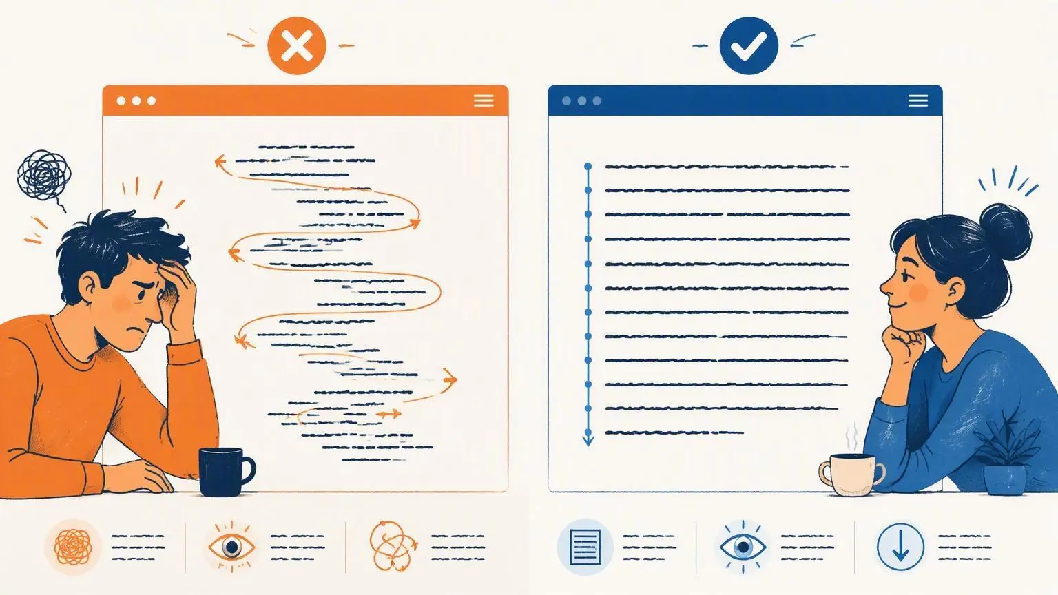
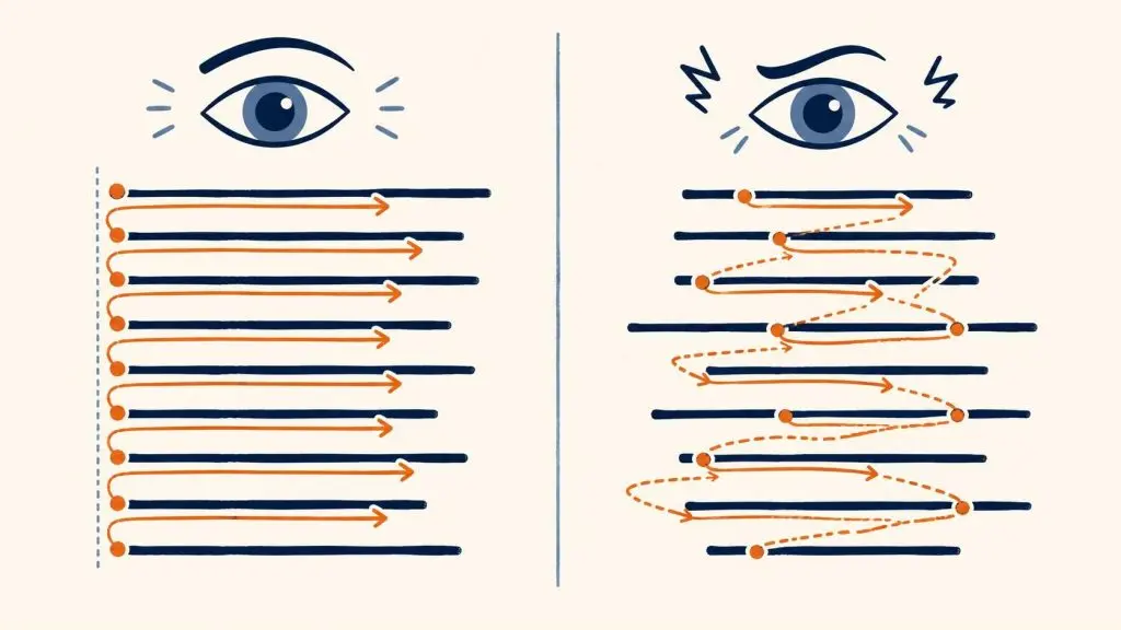
When we read a left-aligned paragraph in English, our eyes have a dependable place to return after finishing each line: the left edge. That consistent starting point helps us move through the paragraph without thinking about the mechanics of reading.
A centered paragraph removes that anchor. Because every line has a different length, every line also starts in a different position. The reader’s eyes must search for the beginning of the next line instead of returning to one predictable location.
That extra effort may be small from line to line, but it adds up. The longer the paragraph, the more noticeable the problem becomes.
In Short…
People’s eyes are used to going all the way to the left when reading. When the text isn’t there, on the left, text is more difficult to read. You might think it looks better, but it’s actually harder to read.
People don’t read websites anymore, in general. But, if there is something they want to stop and read, make it easier on them – always go with left-aligned text, like you see here.
Example of Center-Aligned Text/Copy:
This text is center-aligned. You might think it looks nice, but just try reading it. Your eyes have to come into the middle of the page to find the next bit of text.
It’s not that fun to read, really.
What the Readability Guidance Says
WebAIM’s guidance on text and typographical layout says left-aligned text is almost always the easiest to read. It specifically warns that long blocks of centered text cause each new line to begin in a slightly different location, introducing additional overhead for the reader.
Research into typography and eye movement also supports the broader case for left-aligned text. One eye-tracking study of webpage reading found that left-aligned text can facilitate reading by reducing the number of eye fixations.
This does not mean a centered sentence is automatically inaccessible or that visitors will immediately abandon a page. It means centered paragraphs introduce avoidable friction—especially for people with low vision, dyslexia, cognitive disabilities, or other conditions that make it more difficult to keep their place while reading.
Where Centered Text Still Does Work
Centered text is not inherently bad. It works well when the content is short enough to take in at a glance. Good candidates include:
- Headlines
- Short subheadings
- One-line announcements
- Brief calls to action
- Short quotations
The trouble starts when a centered design element turns into a genuine paragraph. If readers need to move through several lines to understand the message, give them a consistent edge to follow.
The Simple Rule:
- If the text is decorative, brief, or meant to create a moment of emphasis, centering may be perfectly appropriate.
- If the text is meant to be read and understood as a paragraph, left-align it.
Your website’s design should help visitors receive the message—not make them work to find the next line.
And Don’t Get Me Started on Center-Aligned Bullets 😊
Bullets centered is also a big no-no. The bullet anchors the point and you’re moving the text away from the anchor, leaving the bulleted text hanging out in the middle of nowhere.
📄 Download a PDF of This Article