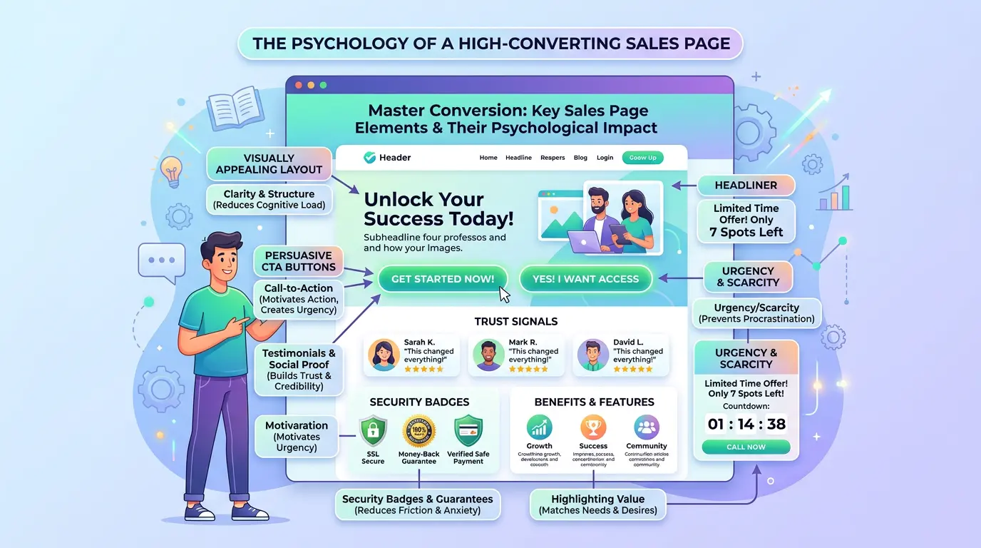
Use Psychology on Your Website to Sell

TL;DR Summary: Lead with the Transformation, Not the Product: Focus on how your product changes lives, not just what it is. Use Social Proof Strategically: Specific testimonials near the buy button work best. Anchor Your Pricing: Show a higher price first to make your offer seem more valuable. Read on for more psychology-backed tips to boost website conversions.
I find conversion so interesting. Like, what is making me want to read something when I’m like halfway into it? How did that happen? There are rules, strategies, and tactics to do this without being sneaky.
Here are 10 psychology-backed tips for selling effectively on websites:
1. Lead with the Transformation, Not the Product
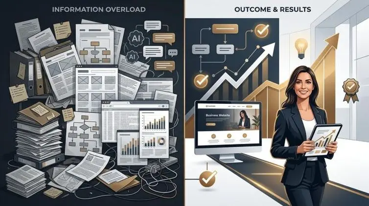
People don’t buy products , they buy better versions of themselves. Your headline shouldn’t describe what you sell; it should describe what life looks like after buying it. “Wake up energized every morning” beats “magnesium supplement.”
This is so important. People get to your website and what to know what’s in it for them. They don’t care about you, at all… nope. Explain how things change after they have your product or service. That wins.
2. Use Social Proof Strategically
Testimonials work best when they’re specific and mirror your target customer. “I made $4,200 in my first month” outperforms “Great product!” enormously. Place proof near the decision point, right above the buy button, not buried at the bottom.
Social proof is huge. It matters a ton. It has to be real, too. In a copywriting class I took, we looked at a sales page that had over 100 testimonials on it. It was a lot to scroll through, but it worked.
3. Anchor Your Pricing
Always show a higher price before your real price. The first number a visitor sees becomes the anchor their brain uses to evaluate everything else. A $97 course feels cheap next to a crossed-out $297. This is why “compare at” pricing is everywhere.
I’ll also add a common mistake. Don’t say the price first and then what they get. That’s a defensive position where you’re trying to justify the price. Instead, show all that they get and it’s only for ____ price. That wins.
4. Reduce Friction at Every Step
Every extra click, form field, or moment of confusion bleeds conversions. Ask only for what you absolutely need. Autofill, guest checkout, and progress bars all reduce the psychological cost of completing a purchase.
Make a sale as easy as possible. I’ve seen this work with Apple Pay and Google Pay. With one click, you get a purchase. So easy.
5. Leverage Loss Aversion
People are roughly twice as motivated by avoiding loss as they are by gaining something equivalent. “Don’t miss out” and “what you’re leaving on the table” framing consistently outperforms pure benefit framing. Limited-time offers work because of this, but only if the scarcity is real.
Some examples:
- Amazon’s “Only 3 left in stock”
One of the most iconic uses. The moment scarcity appears, the calculus shifts from “do I want this?” to “what if I can’t get it later?” It works because availability feels like something you could lose. - Free shipping thresholds
“You’re $8 away from free shipping” isn’t framed as a reward. It’s framed as money you’re about to waste if you don’t add one more item. The $8 shipping fee feels like a loss you can avoid. - Free trials without a card vs. with a card
Companies that require a card upfront and remind you “your trial ends in 3 days” convert better than those that don’t, because canceling feels like an active loss of something you already have. You’ve mentally “owned” the product. - Booking.com’s pressure stack
This is loss aversion on steroids. “Only 2 rooms left,” “17 people looking at this right now,” and “booked 8 times today” all appear simultaneously. Each signal is designed to make waiting feel dangerous. - Credit card rewards expiration
“Your 14,000 points expire in 30 days” is a masterclass in loss aversion. Those points felt dormant until you were told they’d disappear. Suddenly they feel urgent and real.
The underlying principle across all of these is the same: you’re not selling a benefit, you’re making the absence of your product feel costly. The best implementations make that loss feel concrete, imminent, and personal — not abstract or manipulative. When the scarcity or loss is fake, people notice, and trust evaporates fast.
6. Use the Zeigarnik Effect with Progress
The brain has a compulsion to complete unfinished things. On-boarding flows, quizzes, and multi-step funnels that show progress (“You’re 60% done!”) keep people engaged because abandoning feels like a loss. Duolingo built an empire on this.
This is just one of those small things that makes a big difference with conversion.
7. Build Trust Before Asking for Money
Cold visitors rarely buy. The job of your website is often to warm someone up through a micro-commitment first — a free resource, a quiz result, an email signup. Each small “yes” makes the next one easier. This is called the foot-in-the-door technique.
And if you give something away that has value, people are more likely to want to reciprocate. They want to pay you back.
8. Make the CTA Specific and Outcome-Oriented
“Get Started” is weak. “Start losing weight today” or “Send me the free guide” is stronger because it reinforces the benefit at the exact moment of decision. The button copy should complete the sentence “I want to ___.”
I hate buttons that just say “Submit” or something. That’s so lame.
9. Design for Trust Signals
A significant portion of visitors are subconsciously scanning for reasons not to trust you. Money-back guarantees, secure payment badges, real photos (not stock), a named founder, and clear contact info all reduce skepticism. Remove any reason for doubt near the checkout.
Again, less friction. I like to put FAQs after the sales button/form – just in case they’re still on the fence.
10. Tell a Story in Your Copy
The brain processes narrative differently from bullet points — stories trigger empathy and lower resistance. A simple before/after story about a real customer is often more persuasive than a page full of features. If you can make someone feel the problem before presenting the solution, you’ve already done half the selling.
And, yeah… people like stories. I remember as a teenager in church. The parts of the sermons I liked the best were the stories.
Conclusion
What I say is, make the offer so good that people are searching for how to buy it. Having too many calls to action or too many forms on a page reeks of desperation. So do exclamation points.
How you construct a page / offer / product / service matters. Keep making improvements to it. Keep testing. Find the version that converts the best. It’s worth doing. If you can up the conversion rate to be twice as much, you’re in such a better place and you’ll get more conversions with the traffic you already have. Then, add more traffic.
📄 Download a PDF of This Article